Helldivers Logo: Meaning, History, Design, and Symbolism Explained
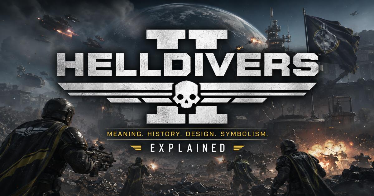
The Helldivers logo is built around a skull-shaped combat mask, set against sharp military type and, in the sequel’s version, a large hidden Roman numeral. Together these pieces answer the question most people are really asking when they search for what the emblem means: the Helldivers are soldiers who go into battles most people would never walk away from. That is the short answer. The rest of this guide breaks down where the logo came from, what each part of it represents, and how the Helldivers 2 emblem changed from the original 2015 mark.
If you have spent time with Arrowhead Game Studios’ cooperative shooter series, you have likely seen this mark on a store page, a loading screen, or a friend’s gaming setup. It reads as aggressive on first glance, but the design carries more intent than a quick look suggests. By the end of this article, you will know the logo’s origin, how its visual identity has evolved, and why the Helldivers emblem still stands out years after the first game launched.
A quick note before we start: some parts of a logo’s meaning come straight from the developers, and some come from how players and designers have read the image over time. We will keep those two things separate throughout this guide so you always know which is which. One confirmed detail worth flagging early: official PlayStation Blog material specifically calls the Helldivers “Super Earth’s elite task force,” and that framing shapes a lot of the design language you will see below.
What Is the Helldivers Logo?
The Helldivers logo is the wordmark and emblem that brands the Helldivers video game franchise, developed by Arrowhead Game Studios and published by Sony Interactive Entertainment. It appears on box art, digital storefronts, in-game menus, and official merchandise, and it is typically the first visual most players connect to the series before they load into a mission.
It helps to separate the franchise logo from the many symbols found inside the games themselves. Super Earth, the fictional government players fight for, has its own flag and seals. Individual factions, ships, and armor sets carry their own emblems too. The Helldivers logo sits above all of that. It is the brand mark for the games as products, not a piece of in-universe propaganda, even though its style borrows heavily from military branding to match the story.
The franchise itself began with the original Helldivers, a top-down cooperative shooter released by Arrowhead Game Studios and published by Sony Computer Entertainment. The game launched in North America on March 3, 2015, followed by European release the next day, with a PlayStation Vita version and a Windows release arriving later that year. A sequel, Helldivers 2, moved the series into a third-person perspective and launched for PlayStation 5 and Windows on February 8, 2024, with an Xbox Series X/S release following on August 26, 2025. Both games use variations of the same core logo identity, which is part of why the mark has stayed so consistent across nearly a decade.
What Does the Helldivers Logo Mean?
The Helldivers logo means soldiers who choose full-speed combat over caution. The name itself comes from combining two ideas: the old phrase “war is hell,” and the act of diving headfirst into that hell rather than approaching it carefully. Soldiers in the game do not creep through combat zones. They drop from orbit directly into the fight, often outnumbered and always under pressure. The logo’s harsh lines, dark tones, and skull-like mask are built to carry that same feeling of full-speed, no-retreat combat.
The design communicates a few things at once. The military-style type feels stenciled and official, like something printed on a supply crate. The mask at the center reads as protective gear built for extreme danger, not decoration. Together, these choices tell you what kind of game this is before you read a single word of marketing copy: fast, violent, and cooperative, with soldiers who accept steep losses as part of the job.
It is worth drawing a clear line here between two kinds of information. Arrowhead and Sony have confirmed the game’s premise, its release history, and its in-universe framing of the Helldivers as elite soldiers. What they have not published is a detailed, official breakdown of every design choice in the logo — no developer statement walks through why the mask has a particular eye shape, for example, or exactly what each line is meant to symbolize. Much of the detailed visual reading you will find across fan sites and design blogs, including some sections below, reflects reasonable interpretation of the artwork rather than a quote from the studio. This guide flags that distinction so you can tell confirmed fact from visual analysis.
The History of the Helldivers Logo
Origins of the franchise
Arrowhead Game Studios built the original Helldivers as a top-down shooter with heavy cooperative multiplayer at its core. From the start, the marketing leaned into a satirical military tone: propaganda-style broadcasts, a fictional government called Super Earth, and a slogan-heavy voice that mimicked old war-bond posters. The logo needed to fit that tone immediately, since most players would see it before they saw any actual gameplay.
The original logo’s visual identity
The first game’s logo used bold, blocky lettering paired with a skull-style emblem, giving it a rugged, stenciled look that matched the top-down, squad-based combat inside the game. It read as tough and utilitarian rather than polished, which suited a smaller-scale shooter aimed at a dedicated cooperative audience.
The jump to Helldivers 2
When Arrowhead began developing Helldivers 2, work started internally years before the public reveal; the sequel was confirmed for PlayStation 5 in December 2020 and later officially unveiled at the 2023 PlayStation Showcase in May 2023. The shift from a top-down camera to a third-person perspective was a major technical and design change, and the sequel’s branding needed to signal that this was a bigger, more cinematic follow-up while still feeling like the same series.
How the branding evolved
The Helldivers 2 logo kept the skull-mask emblem and military lettering that made the original recognizable, but sharpened the presentation for a game built around a AAA console and PC release. A large Roman numeral sits behind the mark’s other elements — the comparison section below covers exactly how much of it shows through and why that treatment was chosen over a plain number.
Helldivers Logo Design Explained
Typography and lettering
Both logos use bold, all-capital lettering with hard edges, closer to a military stencil than a rounded consumer font. This kind of type is common in war-themed branding because it reads as functional and official, like something stamped onto equipment rather than designed for a magazine cover.
Military-inspired visual language
Stripes, sharp angles, and high-contrast dark backgrounds run through the whole identity. These choices borrow directly from real-world military insignia and unit patches, reinforcing the idea that Helldivers are an organized fighting force, not a loose band of adventurers.
Emblem and central imagery
The centerpiece of the design is a skull-shaped mask with hollow eyes, sitting just below the title text. It reads as a piece of combat headgear rather than a literal skull, which fits soldiers heading into hostile, often airless or hazardous environments. The mask gives the logo a face, of sorts, without showing an actual character.
Lines, shapes, and geometric elements
The mark leans on straight lines, angled cuts, and simple geometric shapes rather than curves or ornate detail. This keeps the design legible at small sizes, which matters for a logo that needs to work on a game icon just as well as it does on a poster.
Contrast and overall visual impact
Dark backgrounds paired with lighter type and emblem elements give the logo strong contrast, so it stays readable against almost any background color used in marketing materials. That contrast is also part of why it photographs and prints well on merchandise.
Why the design fits a sci-fi military shooter
Every element serves the same goal: signal “military,” “dangerous,” and “serious” within a fraction of a second. For a franchise built on satirical war stories and chaotic cooperative combat, a logo that reads as tough and official first, and stylish second, fits the tone of the games themselves.
Helldivers 2 Logo vs. Original Helldivers Logo
Key visual similarities
Both marks share the same bones: bold military type, a skull-style mask emblem, and a dark, high-contrast presentation. Someone familiar with the original game can recognize the sequel’s logo as part of the same family at a glance.
Major differences
The Helldivers 2 version is more refined, with cleaner edges and a more cinematic presentation suited to a modern console release. It also introduces the large background Roman numeral “II,” a feature the original logo did not need since there was no prior entry to distinguish itself from.
How the sequel communicates scale and continuity
The updated logo needed to do two jobs at once: prove this was a bigger, more ambitious game, while still reassuring longtime fans that it was the same Helldivers they remembered. Keeping the mask and lettering style intact handled continuity; sharpening the execution and adding the “II” handled scale.
The significance of the “II” treatment
Why does the Helldivers 2 logo hide its own sequel number? The Roman numeral sits behind the main elements of the mark, partially covered by the title text, the stripes, and the mask itself, with only its top and bottom edges visible. That treatment let the sequel claim its own identity without breaking continuity with the original mark. Roman numerals also carry a formal, almost monumental weight compared to a plain number “2,” which fits a franchise that frames its soldiers as legendary figures within its own fiction.
What changed and what remained recognizable
The overall silhouette, color approach, and central mask stayed close enough that fans could identify Helldivers 2 as a sequel on sight. The polish level, numeral treatment, and overall confidence of the mark were what shifted to match the sequel’s bigger scope.
Symbolism Behind the Helldivers Logo
The following points reflect common visual interpretations of the design rather than a direct developer statement, since Arrowhead has not published a symbol-by-symbol breakdown of the logo.
- Military identity. The stencil type and structured layout echo real unit patches and insignia, positioning the Helldivers as a formal fighting force rather than a ragtag group.
- Courage and sacrifice. The mask’s exposed, hollow-eyed look suggests soldiers facing danger head-on, without the comfort of a fully human face left visible.
- Conflict and danger. Sharp lines and heavy contrast create tension in the design itself, mirroring the constant threat found throughout the games.
- Teamwork and collective action. Because the emblem represents a unit rather than one named hero, it fits a franchise built entirely around squad-based cooperative play.
- Super Earth and patriotic imagery. The bold, poster-like presentation echoes classic war-bond and recruitment art, matching the games’ fictional government and its heavy use of patriotic messaging.
- The contrast between heroic presentation and satire. The logo presents the Helldivers as noble and elite, while the games themselves often poke fun at that same propaganda, letting players spend individual soldiers’ lives freely in service of a system that always calls them heroes. That gap between glossy branding and messy reality is part of the franchise’s identity, and the logo plays its role by taking the “heroic soldier” imagery completely straight.
How the Logo Fits the World of Helldivers
Inside the fiction, Helldivers are described as an elite task force serving the Federation of Super Earth. Official PlayStation Blog material states plainly that the Helldivers are Super Earth’s elite task force, tasked with defending humanity and spreading the in-universe ideal of “Managed Democracy” across a hostile galaxy. That framing lines up closely with what the logo is trying to sell: disciplined, respected, effective soldiers.
The wider fiction complicates that picture on purpose. Super Earth is written as a propaganda-heavy government, and the games make it clear that ordinary Helldivers are treated as expendable in practice even while being celebrated in official messaging. Players are constantly reinforced through cloning and resupply, dying by the dozens in a single mission without changing the tone of Super Earth’s broadcasts. The logo does not show any of that darker context directly, but it works because of it. A clean, heroic-looking emblem sitting on top of a story about disposable soldiers is exactly the kind of contrast the franchise is built on, and Helldivers 2 has been widely compared to the film Starship Troopers for using the same trick: presenting militarism with a straight face while quietly inviting players to notice the satire underneath.
Why the Helldivers Logo Is So Recognizable
A few practical design choices explain why this logo sticks in players’ memory:
- Strong silhouette and contrast. The mask and lettering hold their shape even at small sizes, like a taskbar icon or a thumbnail.
- A military and sci-fi aesthetic that stands apart. Few other major shooters combine stencil-style branding with a skull-mask emblem in quite the same way, which helps the logo avoid blending into a crowded genre.
- Memorable, no-nonsense typography. The bold, blocky lettering is easy to read and easy to recall, even for people who have never played the games.
- A tight connection to the game’s identity. Everything about the mark, from the mask to the type, matches the tone of the games themselves, so the branding never feels disconnected from the product.
- Consistency across promotional and in-game branding. The same core elements appear on store pages, loading screens, and merchandise, which reinforces recognition every time a player sees the games in a new context.
Helldivers Logo and the Franchise’s Visual Identity
The logo does not exist in isolation. Armor sets, weapon designs, in-game propaganda posters, and faction emblems throughout Helldivers and Helldivers 2 all share a similar visual language: stenciled type, high contrast, and a stripped-down military look. That consistency helps the games feel like a cohesive universe rather than a collection of disconnected assets.
This is also why the logo works well beyond the game’s cover art. Because its style already matches the armor, ships, and propaganda seen in actual gameplay, it translates easily onto merchandise, community fan art, and promotional material without feeling like a mismatched sticker slapped onto unrelated content. The mark reads as part of the same world as everything else in the games, which is a big part of why it has built such a strong following among players.
Common Questions About the Helldivers Logo
What does the Helldivers logo mean?
The Helldivers logo combines a skull-shaped combat mask with bold military-style lettering to represent soldiers who face extreme danger head-on. The name itself reflects the idea of diving directly into “hell,” or brutal combat, rather than approaching it cautiously.
Who designed the Helldivers logo?
Arrowhead Game Studios developed the Helldivers franchise, with Sony Interactive Entertainment (Sony Computer Entertainment for the original game) publishing both titles. Neither company has publicly named a specific individual credited as the logo’s designer, so no verified designer name can be confirmed here.
What inspired the Helldivers name?
The name draws on the phrase “war is hell” combined with the idea of soldiers diving straight into that hell rather than easing into combat. It fits a franchise built around orbital drops directly into hostile territory.
Is the Helldivers 2 logo different from the original?
Yes, though the two share a clear family resemblance. Helldivers 2 keeps the mask emblem and military lettering style of the original but refines the execution and adds a large background Roman numeral “II” to mark it as a sequel.
What does the “II” in the Helldivers 2 logo represent?
The Roman numeral signals that the game is a direct sequel while giving the mark a more formal, monumental feel than a standard number would. It sits behind the main design elements, partially covered but still visible.
What do the symbols in the Helldivers logo represent?
The mask suggests protective combat gear and a soldier facing danger without flinching, while the stencil-style type and stripes echo real-world military insignia. These readings come from visual interpretation of the design rather than an official symbol-by-symbol statement from the developers.
Is the Helldivers logo an official Super Earth symbol?
No. The Helldivers logo is the franchise’s branding, used to market the games as products. It is a different thing from Super Earth’s in-universe flag and seals, which exist as part of the game’s fictional world rather than as real-world marketing assets.
Helldivers Logo vs. Super Earth Emblem
It is easy to mix these up, since both use a similar visual style. The Helldivers logo is the franchise’s real-world brand mark, used on box art, storefronts, and merchandise. Super Earth’s flag and emblems, by contrast, exist entirely within the fiction of the games, representing the in-universe government players are fighting for.
Fans sometimes encounter several related symbols across the franchise because the games use environmental storytelling heavily, filling menus, loading screens, and propaganda posters with in-universe branding. Faction seals, armor insignia, and Super Earth’s own emblem all live alongside the main Helldivers logo, which can blur the line between “official franchise branding” and “in-universe prop design” for players who are not tracking the difference closely. Knowing that the actual Helldivers logo sits one level above all of that in-game material makes it easier to tell which symbol you are looking at.
Final Thoughts
The Helldivers logo works because every part of it points in the same direction. The mask signals danger and sacrifice. The stenciled type signals a military organization. The dark, high-contrast presentation signals a game that does not take its violence lightly, even while wrapping it in satire. From the original 2015 release through Helldivers 2’s 2024 launch and beyond, the mark has stayed recognizable while still growing more polished to match the series’ rising scale.
None of that happened by accident. A logo built around a skull and stencil type could easily read as generic in a genre full of military shooters, but the Helldivers mark earns its place by staying tightly connected to the story, tone, and cooperative chaos found inside the actual games. That is why it remains one of the more memorable pieces of branding in modern PlayStation gaming, and why it is likely to stay recognizable as the franchise continues to grow.
FAQs
Does the Helldivers logo appear the same across all platforms?
Yes. The core design stays consistent across PlayStation, Windows, and Xbox versions of the games, with only minor formatting differences for platform-specific store requirements.
Has the Helldivers logo changed since Helldivers 2 launched?
The core mark has stayed stable since the sequel’s February 2024 launch. Arrowhead has released numerous in-game updates and crossover content since then, but the franchise’s primary logo identity has remained consistent.
Why does the Helldivers logo use a skull instead of a human face?
Using a mask rather than a visible face keeps the emblem focused on the idea of a soldier or a role, rather than any single character, which fits a franchise built around anonymous, replaceable troops fighting as a unit.
Is fan-made Helldivers logo merchandise official?
Community-made items, such as 3D-printed replicas or fan art based on the logo, are separate from official merchandise sold through licensed retailers like PlayStation Gear. Confirmed developer or publisher facts about official products should always be checked against Sony and Arrowhead’s own channels rather than fan sources.